Complete Guide to Widgets in Odoo 19: Types, Syntax, and Examples
Official Website: www.odoo.com
Documentation: https://www.odoo.com/documentation/19.0/developer/reference/backend/views.html
Introduction
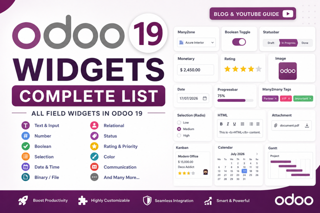
In Odoo, a widget is a component that determines how a field is displayed and interacted with on the user interface . While a field defines the type of data stored in the database (e.g., Char, Integer, Date), a widget defines the presentation and behavior of that data on forms, list views, and other interfaces .
Think of it this way: A field is the "what" (the data type), and a widget is the "how" (how users see and interact with that data). For example, a Char field can be displayed as a simple text input, an email link, a URL, or a badge—all using different widgets .
Why Use Widgets?
Widgets are essential for creating a better user experience in Odoo . They provide:
- Enhanced User Experience: Widgets like date pickers, color pickers, and image uploaders make forms more intuitive and user-friendly .
- Data Validation: Widgets like
emailandurlvalidate input format automatically . - Visual Representation: Progress bars, percentage pies, and Kanban cards make data more visually understandable .
- Interactive Features: Toggle switches, sliders, and drag-and-drop controls make data entry faster and more engaging .
- Customization: You can create custom widgets for specific business needs using OWL (Odoo Web Library) .
Basic Syntax
To use a widget, you add the widget attribute to a field in your XML view:
<field name="field_name" widget="widget_name"/>Some widgets accept additional options:
<field name="field_name" widget="widget_name" options="{'option1': value1, 'option2': value2}"/>Complete List of Widgets in Odoo 19
| Widget Name | Field Type | Description |
|---|---|---|
email | Char | Displays as clickable mailto link |
phone | Char | Displays as clickable tel link |
url | Char | Displays as clickable URL link |
badge | Char, Selection | Displays value inside a rounded badge |
copy_to_clipboard | Char, Text | Adds a copy button |
image | Binary | Uploads and displays images |
binary | Binary | Uploads any file type |
pdf_viewer | Binary | Displays PDF files inline |
sign | Binary | Electronic signature pad |
monetary | Float | Formats numbers as currency |
percentage | Float | Displays % symbol after value |
progressbar | Float, Integer | Visual progress bar |
percentage_pie | Float, Integer | Displays value in a circular chart |
time | Float | Formats as hh:mm time |
remaining_days | Date, Datetime | Shows days remaining until the date |
daterange | Datetime | Selects start and end date range |
boolean_toggle | Boolean | Toggle switch instead of checkbox |
button | Boolean | Radio button that works without edit mode |
priority | Selection | Star rating system |
statusbar | Selection | Arrow progress bar for workflow status |
radio | Selection, Many2one | Displays as radio buttons |
many2one_avatar_user | Many2one | Displays user avatar image |
many2many_tags | Many2many | Colored tag pills |
kanban_activity | Many2many | Activity management with color-coded icons |
color_picker | Integer | Color palette selection |
handle | Integer | Drag handle for manual ordering |
1. Char Widgets
Char widgets handle text input with specialized formatting and behavior.
Displays the text as a clickable email link.
<field name="email" widget="email"/>phone
Displays the text as a clickable phone number link.
<field name="phone" widget="phone"/>url
Displays the text as a clickable URL link.
<field name="website" widget="url"/>badge
Displays the value inside a rounded badge. The value cannot be edited .
<field name="status" widget="badge"/>copy_to_clipboard
Adds a copy button to the field .
<field name="code" widget="copy_to_clipboard"/>2. Date and Datetime Widgets
Date and datetime widgets handle time-based data with calendar pickers and timezone conversions .
remaining_days
Displays how many days remain until the selected date . Shows "In 5 days" or "2 days ago" based on today's date.
<field name="deadline" widget="remaining_days"/>Use Case: Expiry tracking, project deadlines, reminder workflows .
daterange
Allows users to select a date range with start and end dates .
<field name="date_begin" widget="daterange" string="From"
       class="oe_inline" options="{'related_end_date': 'date_end'}"/>
<field name="date_end" widget="daterange" string="To"
       class="oe_inline" options="{'related_start_date': 'date_begin'}"/>
Use Case: Project durations, leave applications, booking systems .
date
Applies to Datetime fields to display only the date portion, hiding the time .
<field name="order_date" widget="date"/>3. Binary and Image Widgets
Binary widgets handle file uploads, while image widgets are specialized for images with thumbnail previews .
binary
Uploads and stores any type of file (PDF, DOCX, ZIP, etc.) .
<field name="file_data" filename="file_name" widget="binary"/>
<field name="file_name" invisible="1"/>
image
Uploads and displays images with preview . Odoo automatically maintains multiple image sizes .
<field name="image" widget="image"/>
<!-- With custom size -->
<field name="image" widget="image" options="{'size': [128, 128]}"/>
<!-- Specific preview size -->
<field name="image" widget="image" options="{'preview_image': 'image_1024'}"/>
pdf_viewer
Displays PDF files inline in the form view .
<field name="document" widget="pdf_viewer"/>sign
Provides an electronic signature pad .
<field name="signature" widget="sign"/>4. Numeric Widgets
Numeric widgets format and display numbers in various visual styles.
monetary
Formats numbers as currency with the correct currency symbol .
<field name="amount_total" widget="monetary"/>progressbar
Displays a horizontal progress bar based on the field value .
<field name="progress" widget="progressbar"/>percentage_pie
Displays the value inside a circular percentage chart .
<field name="completion" widget="percentage_pie"/>percentage
Displays the value with a % symbol .
<field name="discount" widget="percentage"/>time
Formats the value as hh:mm time format .
<field name="duration" widget="time"/>5. Boolean Widgets
Boolean widgets provide visual alternatives to standard checkboxes .
boolean_toggle
Displays a toggle switch instead of a checkbox . Works without switching to edit mode .
<field name="active" widget="boolean_toggle"/>button
Displays as a radio button that works without switching to edit mode .
<field name="is_premium" widget="button"/>6. Selection Widgets
Selection widgets provide different ways to choose from predefined values .
priority
Displays a star rating system (default 3 stars) . The first value is 0 stars (no selection) .
<field name="priority" widget="priority"/>statusbar
Displays values as an arrow progress bar for workflow status .
<field name="state" widget="statusbar" statusbar_visible="draft,sent,sale"/>radio
Displays all values as radio buttons .
<field name="payment_method" widget="radio"/>badge
For Selection fields, displays the value inside a rounded badge .
<field name="status" widget="badge"/>badges
Displays all selectable values as rectangular badges .
<field name="tags" widget="badges"/>7. Relational Widgets
Relational widgets handle fields that link to other models .
many2one_avatar_user
Displays the user's avatar image for Many2one fields .
<field name="user_id" widget="many2one_avatar_user"/>many2many_tags
Displays Many2many fields as colored tag pills .
<field name="tag_ids" widget="many2many_tags" options="{'color_field': 'color'}"/>kanban_activity
Manages activities with color-coded icons (Green=Future, Yellow=Today, Red=Overdue) .
<field name="activity_ids" widget="kanban_activity"/>8. Kanban View Widgets
Specialized widgets for Kanban cards .
color_picker
Allows users to select a color for the Kanban card .
<field name="color" widget="color_picker"/>handle
Displays a drag handle for manual record ordering .
<field name="sequence" widget="handle"/>statinfo
Used for "Smart Buttons" on forms .
<field name="order_count" widget="statinfo" string="Orders"/>9. Third-Party Widgets
The Odoo community and app store offer many additional widgets:
json_list
Turns a Char or Text field into an interactive tag input .
<field name="tag_list" widget="json_list" placeholder="Type and press Enter"/>Key Features: Type and press Enter to add badges, one-click removal, valid JSON storage .
multi_selection_char
Multi-select widget with checkbox grid or badge token UI .
<!-- Checkbox design -->
<field name="parts" widget="multi_selection_char"
       options="{'values': ['Engine', 'Rims', 'Spoilers'], 'columns': 2}"/>

<!-- Badge design with allow_new -->
<field name="tags" widget="multi_selection_char"
       options="{'values': ['Urgent', 'Review'], 'design': 'badge', 'allow_new': True}"/>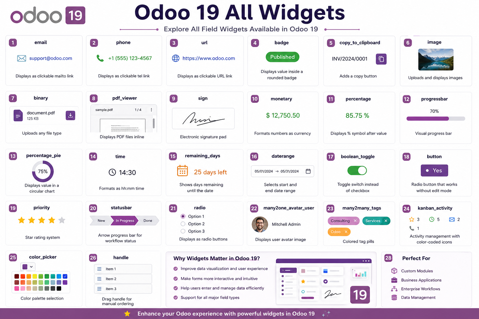
Conclusion
Widgets are essential tools in Odoo development that transform how users interact with data. By choosing the right widget for each field, you can:
- Create more intuitive and user-friendly interfaces
- Improve data validation and input accuracy
- Visualize data in meaningful ways
- Build interactive and engaging user experiences
- Customize Odoo to match specific business needs
Whether you're using built-in widgets or creating custom ones with OWL, understanding Odoo's widget system is key to becoming a proficient Odoo developer.